Outlook for iOS Icon Update
Microsoft’s Outlook for iOS released a major update to the user interface back in January when they slowly rolled out the blue header and streamlined interface. Two days ago, they followed that up with a redesigned app icon.
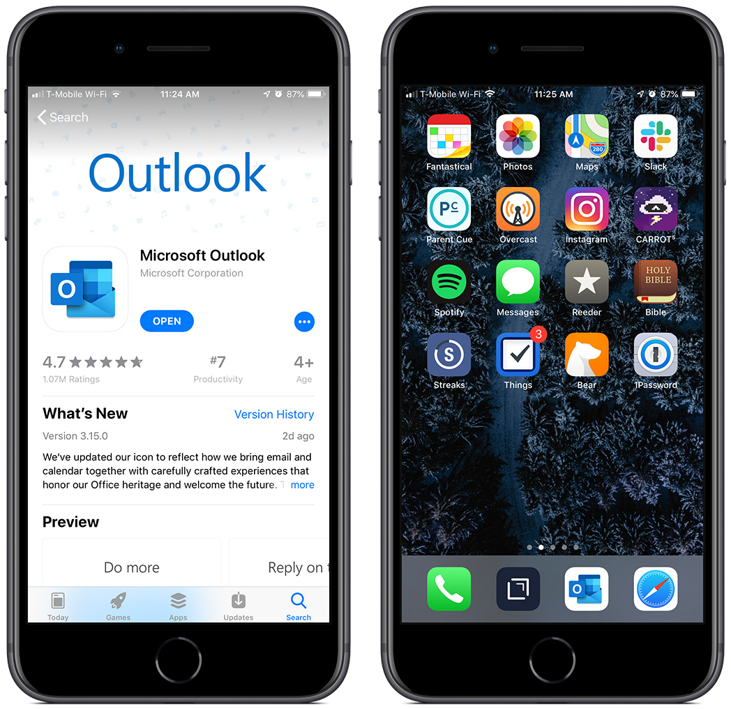
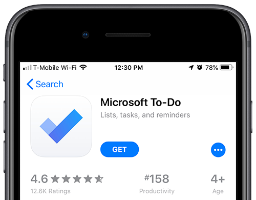
Microsoft’s Outlook app on iOS is the first Office app on the platform to get the redesigned icons that Microsoft unveiled a couple of weeks ago. The new Outlook icon is actually superposed on a white background, and the result is something that looks quite similar to other iOS apps like Gmail (most icons for Google’s iOS apps also use a white background), or Microsoft’s own To-Do app.
Let me start by saying that I love the new app interface. It’s much cleaner, feels more in-line with where iOS overall is heading, and it’s just well designed. However, I really don’t think this new icon is a good option. In their release post, they highlight that other apps have a white background, but they ignore the fact that those are paired with a simple icon on that white field.1
By itself, the new Outlook icon is a decent looking logo, BUT it fits primarily within the context of Windows. The multi-layer styling doesn’t mesh with any other iOS logo. They would have been much better off using the blue envelope icon without the small “O” logo off to the side. The current result feels crowded and nothing is distinctive.
Simplicity in iOS icons is essential because you get a relatively small window to identify your app in a screen crowded with apps.2 It’s easy to confuse apps with each other if their icons are too similar or aren’t clear enough at a glance. Especially when viewing the icon in a notification.
And what’s more, they appear to understand this given the simplicity of the icon for the Microsoft To-Do app they highlight as an example. Just simplifying the icon to one “iconic” (pun intended) graphic would do wonders for Outlook.
Just today I confused the new icon with the icon for Facebook Messenger when a new email came in. It was a little off-putting.
All in all, the overall update to Outlook for iOS is a good one, but they just missed the mark on what makes an iOS app icon distinctive and effective.